Why No One is Signing Up for Your Free Trial (And How to Change That)

Getting sign-ups for your free trial seems like it should be the easiest thing in the world. You just created a fantastic product, and now you’re offering it up for a free test-drive. Who wouldn’t want to give it a shot?
That’s why it’s so discouraging if your free trial doesn’t get nearly as many sign up as you’d hoped. You might start doubting everything: your market research, your landing page copy, your offer, or—even worse—the product itself.
Now, the fact is, there are countless reasons for why someone won’t sign up, and they’re entirely out of your control.
At the same time, let’s face it: your offer clearly isn’t resonating with your audience if no one is signing up.
But don’t worry. With some troubleshooting and fine-tuning, you can find the problem and start turning those results around.
If no one is signing up for your free trial, it might be because:
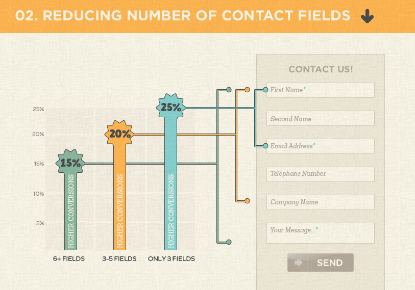
You’ve Made It Too Difficult to Sign Up
The last time you took a free sample from Trader Joe’s or Costco, did you have to provide your name, email address, phone number, and business name? Of course not. No matter how delicious that sample looks, giving up all that information just isn’t worth it.
The value of the offer must match the amount of information you’re asking for. It’s an exchange, after all. When your potential customers see your sign-up form, their mind is already figuring out whether the requirements of this form outweigh the benefits of your offer.
The key, of course, is to minimize the barriers to entry as much as you can, such as by reducing the number of fields in a form. Unbounce found that you can improve conversions by 25% by asking only for a first name and email address.
However, this doesn’t mean you should never ask for more. More fields bring higher quality leads, but fewer fields can bring more leads. Either way, Unbounce insists that you should test your form fields to find out what works best for you.
Your Value Proposition Needs Work
Your value proposition is one of the most important factors that determines your conversion rate, according to copywriter Jacob McMillen.
A value proposition is why someone should use your product. The graphics, design, text, videos, and other aspects of your landing page all play into your value proposition. McMillen breaks down the four most important characteristics that every value proposition should have:
- Conveys a clear, easily understood message
- Speaks to the unique value your business provides
- Explicitly targets a specific audience segment
- Makes a clear promise regarding the benefits being delivered
A common mistake in forming value propositions is using the language of features rather than benefits. For example, instead of rattling off jargon like “cross-functional collaboration,” your audience will better appreciate a practical benefit like, “it lets you share meeting notes.”
Testing a value proposition doesn’t end there. Split testing combinations of graphics, design, and text can yield a staggering increase in sign-ups.
Below, McMillen shows a landing page that outperformed its previous iteration by 408% thanks mostly to some changes in wording.
 You Haven’t Properly Demonstrated Its Benefits
When you try a new product for the first time, there’s going to be a learning curve. Some software is so complex that you might not even understand how to solve the problem it promised to fix (and reading a lengthy user manual doesn’t help).
This situation is all too common in the world of SaaS, so consumers have become more wary. They don’t want to spend the time learning your product if you haven’t clearly demonstrated to them just how it’s going to help them.
That’s where an effective demonstration comes into play. And by “demonstration” we don’t mean a video that gives a run-down of all the features or a tutorial for one particular use-case.
Process Street provides a guide on how to create a compelling demonstration, as well as several examples. One shining example is Trello’s demonstration video—it manages to show an overview of the entire program, explains how to use the various features to make managing your workflows easier, and does it all with easy-to-follow narration.
Below, the Trello video’s narrator doesn’t just explain how each feature works. Using an example scenario, he explains how each feature helps him achieve his hypothetical goal.
You Haven’t Shown What Your Free Trial Actually Is
What’s worse than a sign-up page that miscommunicates the purpose of your product? One that makes the user question what they’re even receiving.
There are many types of free trials out there, each with their own kinds of restrictions. Some limit the amount of times a feature can be used, restrict certain features, or simply expire after a set number of days.
A potential user will not bother with a free trial if they can’t be certain it will allow them to do what they need to. Make it loud and clear what they will or will not be getting with their free trial in order to lead them into a sign up.
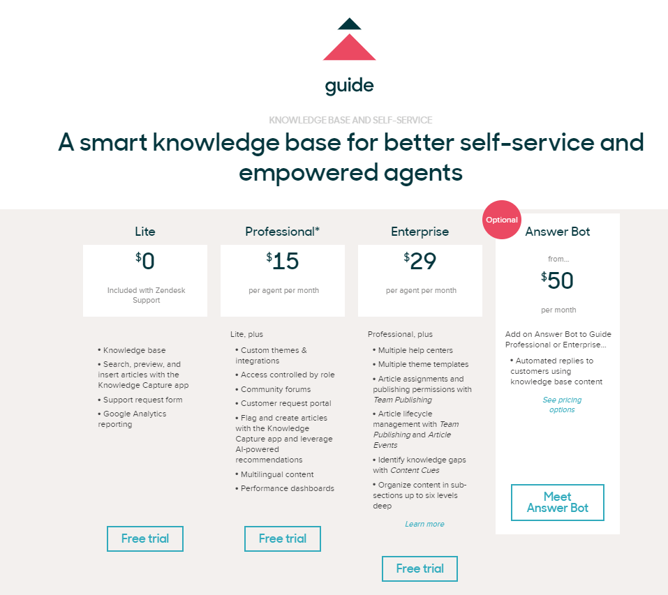
A great way to do this is with a table, showing both free-trial features as well as what features and services become available with each paid upgrade. Zendesk does this well in the example below.
Your Language is Alienating Customers
Knowing how your customers speak is critical. If you can adapt their language and “talk the talk,” it will boost your product’s credibility and instill confidence.
In one sense, speaking the same language means you won’t have to belabor a technical audience with explanations for common industry terms. The right use of jargon and buzzwords can help get a message across more succinctly than a long explanation. After all, brevity is key for holding a reader’s attention.
But don’t go overboard. Too much jargon can alienate potential buyers, making them feel excluded. For example, your product may be designed for a highly technical user, but the person in charge of purchasing that product might get lost in the lingo.
Striking the right balance can go a long way in improving your value proposition and, in turn, increase the rate of free-trial sign ups on your landing page.
Conclusion
There’s not one “right” way to increase sign-ups to your free trial, but there certainly are several wrong ways. They mostly have to do with failure to communicate the value of your product to the user’s specific pain points.
Did you commit some of the sins on this list? There’s no need to tear down your whole campaign. Start making incremental changes to your text, graphics, designs, and videos. Then, start testing.
With frequent split testing, you can eventually find the magic combination of elements that starts boosting your free trial sign-ups.


